Overview
For 6 months in 2016, I freelanced for e-Harmony on their new product, Elevated Careers. Elevated leverages eHarmony’s compatibility algorithms and technology to match job seekers and companies. By analyzing three points of compatibility (skills, personality, and culture) the service aimed to help employees find meaningful, engaging jobs and companies raise their retention rates by hiring the right candidate.
Elevated was already built and in beta when I came on. My role as Senior UX Designer was to oversee the user testing and make improvements.
Most of my time was spent reviewing user feedback, doing research, and working on new features with the project manager, then presenting those ideas for approval. I also coordinated with both on-site and off-site dev teams to implement updates.
eHarmony
Research / UX /UI
Product Manager | N. Yarin
Process
1
Research & Exploration
Projects started with direction from the Product Manager and included adding features or improving existing functionality. Reviewing previous designs done and surveying the current landscape was a part of this, as was understanding all the beta users' feedback.
There were many intricacies in this product. Having an open dialogue with the PM was vital here. She was great and the initial sketching, whiteboard, ideation phase of the work was the most rewarding.
2
Present Ideas
After clearly identifying the problems and designing solutions, I presented to dept heads from Elevated and Eharmony. Since this group consisted of people working solely on the product and those less familiar, it required both a clear overview of current features and a granular explanation of suggested new improvements. These presentations would include an outline of the problem, features review, user feedback highlights, competitive analysis, proposed solutions, technical requirements, and time frame to complete.
3
Guide Implementation
New design new features were done in Sketch and became part of the library. I coordinated with both on and off-site dev teams to make site updates. While there, I updated the process for the on-site team to include Avocode, so hand-offs would be easier for everyone. Reviewed updates once live.
4
Review Results
Positive responsive from the beta community was our metric of success. After changes were made to the site, we incorporated new questions regarding the updates and reviewed feedback. Most of the issues we were working on revolved around comprehension of the product and features. Asking direct questions as to users' expectations and their understanding of options was the best way to judge our progress.
Job Seeker
Improvements
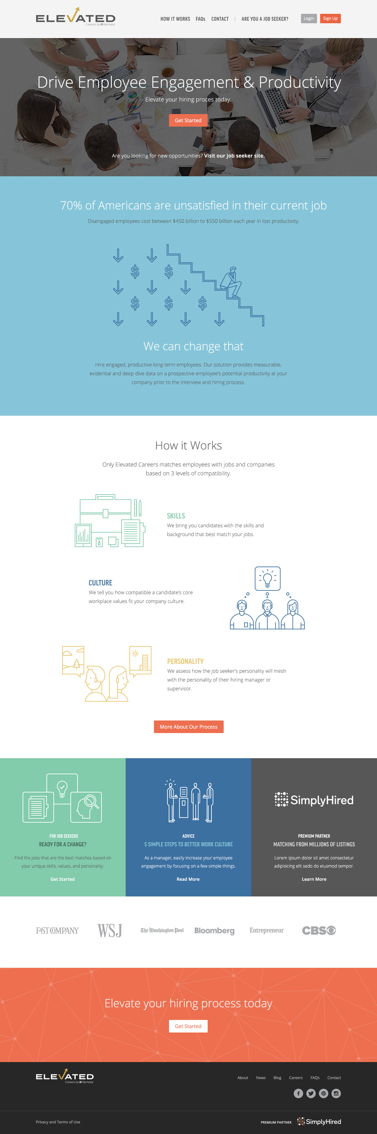
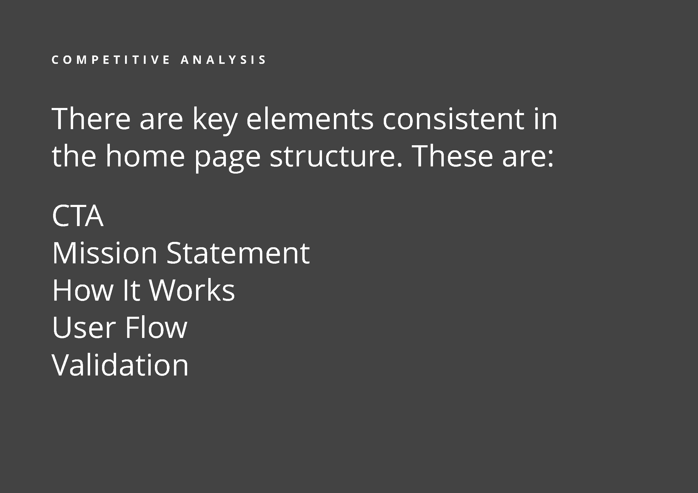
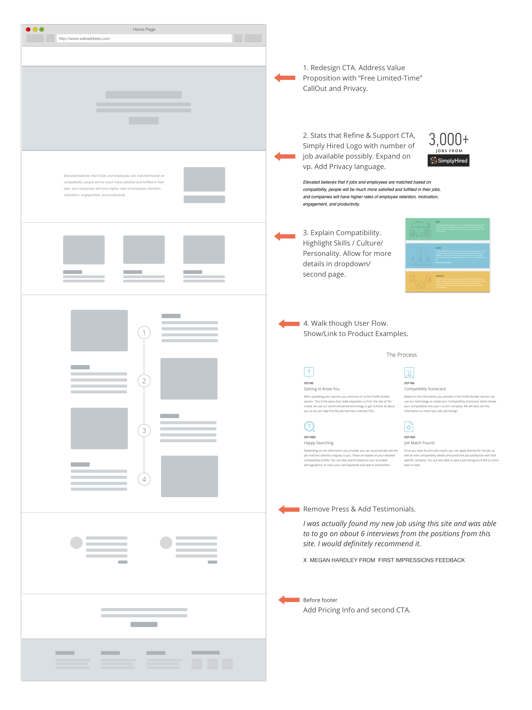
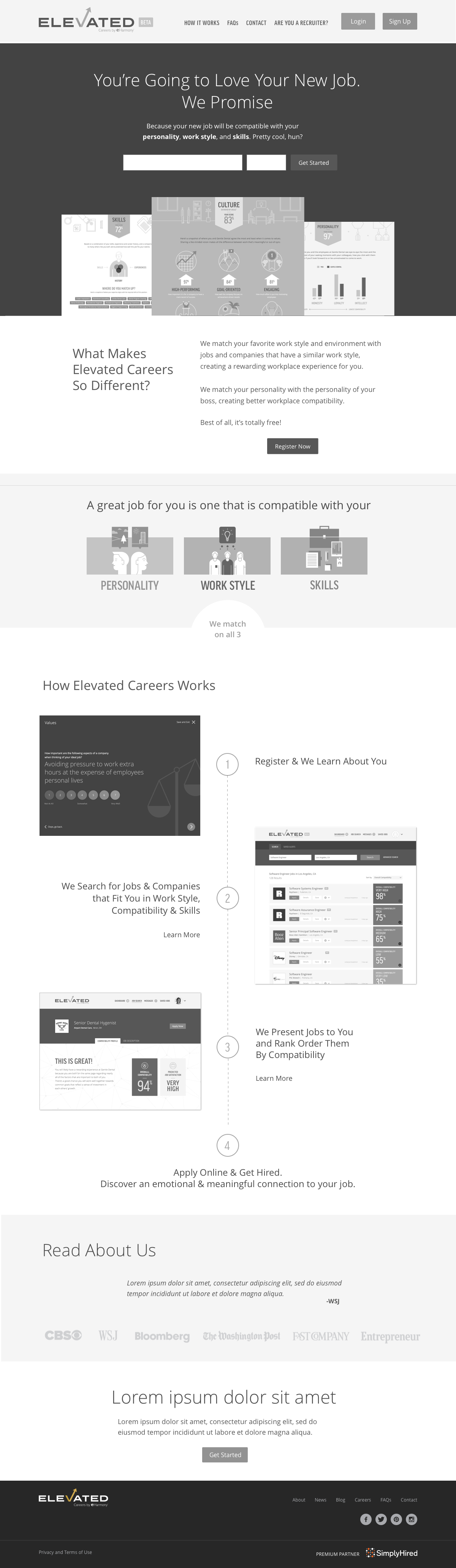
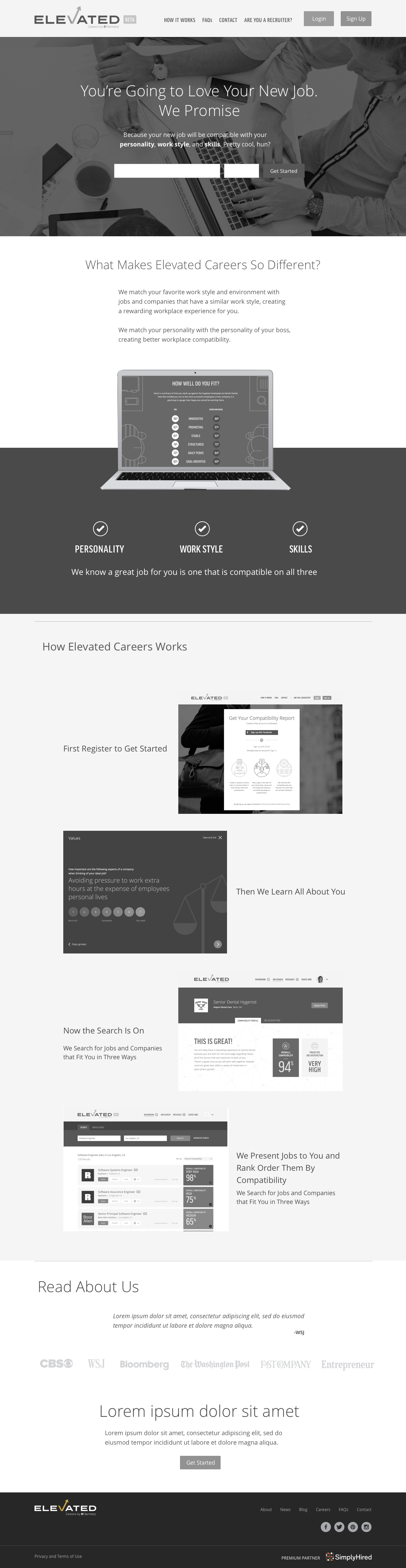
Home Redesign
My first project was to improve the home page. This was important because the onboarding process includes a long and in-depth questionnaire. The home page needed to explain the benefits of the product and prepare users for that experience.
The redesign included many meetings with VPs to highlight issues with the current page, share some user comments and universal pain points, review competitive analysis, present new solutions and listen to their thoughts.
The proposed changes included:
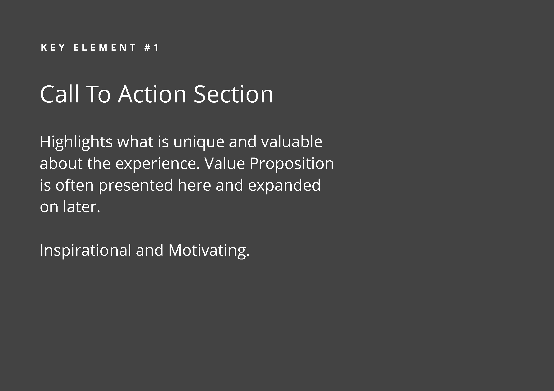
- Clarify the value proposition & focus the page to support that message.
- Create stronger, clearer CTA.
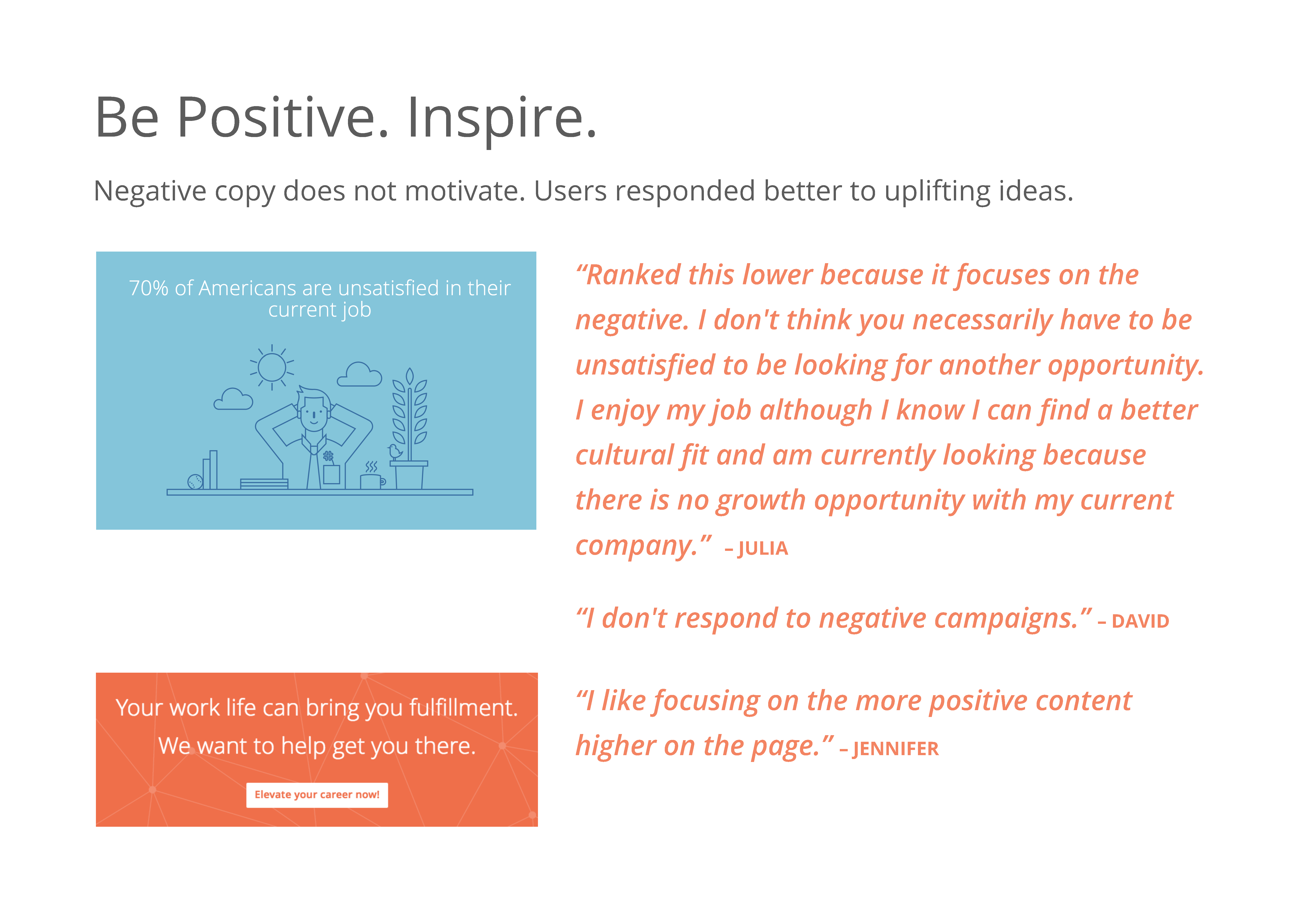
- Revise the copy to be motivational and positive.
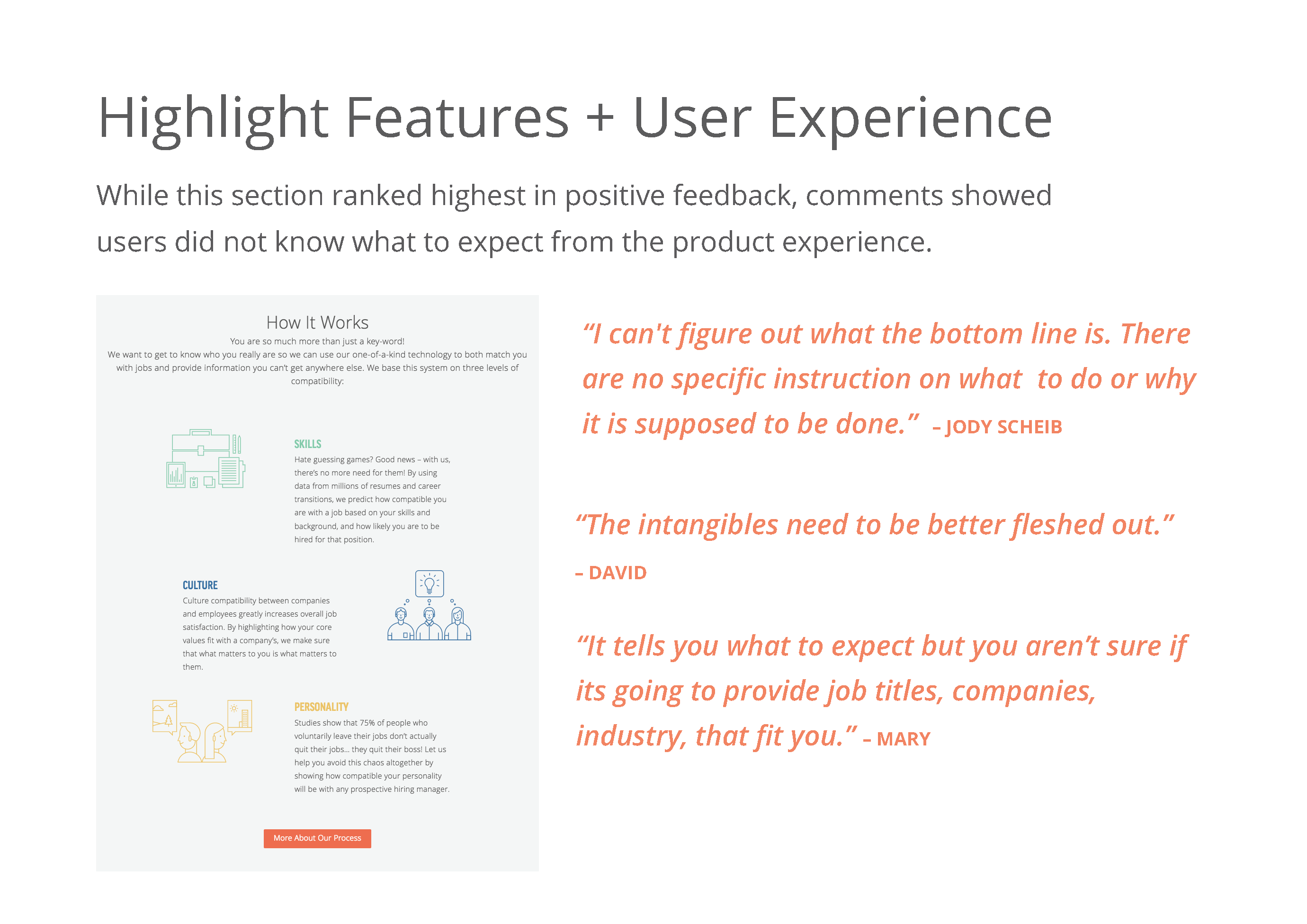
- Show the product and highlight the features.
- Validate with press quotes.
- Add pricing details.
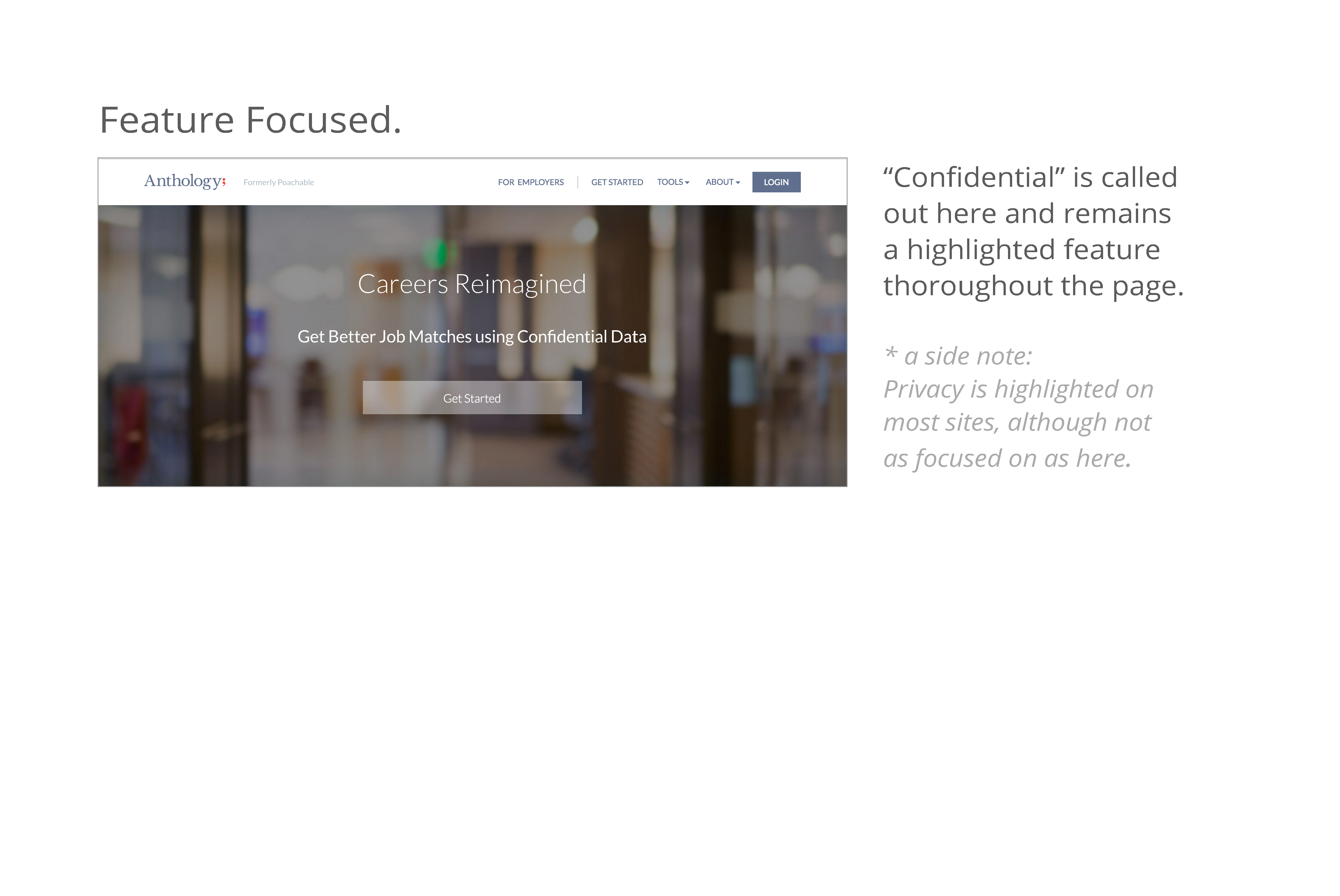
The Value Proposition
Clarify & Supporting that Message
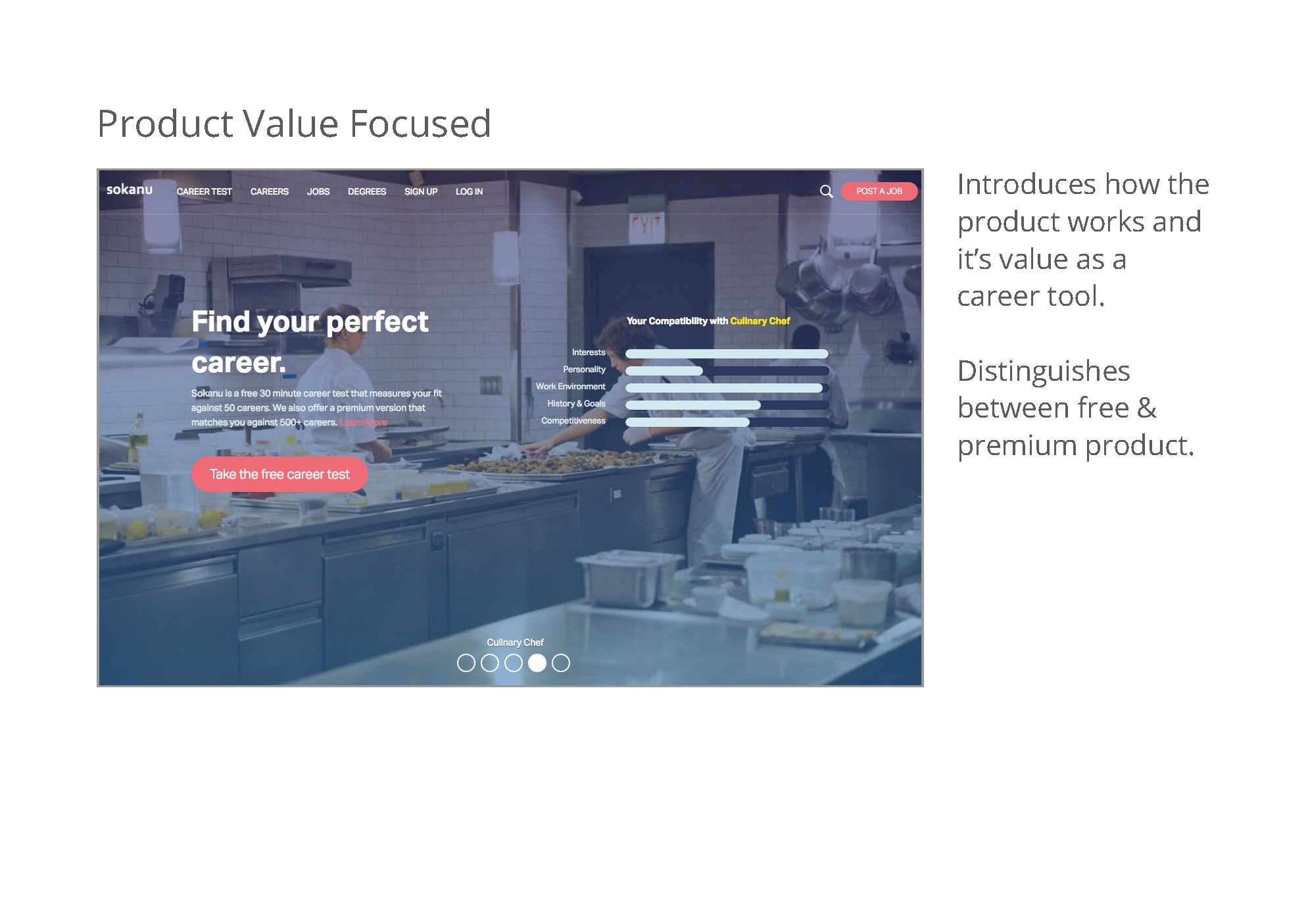
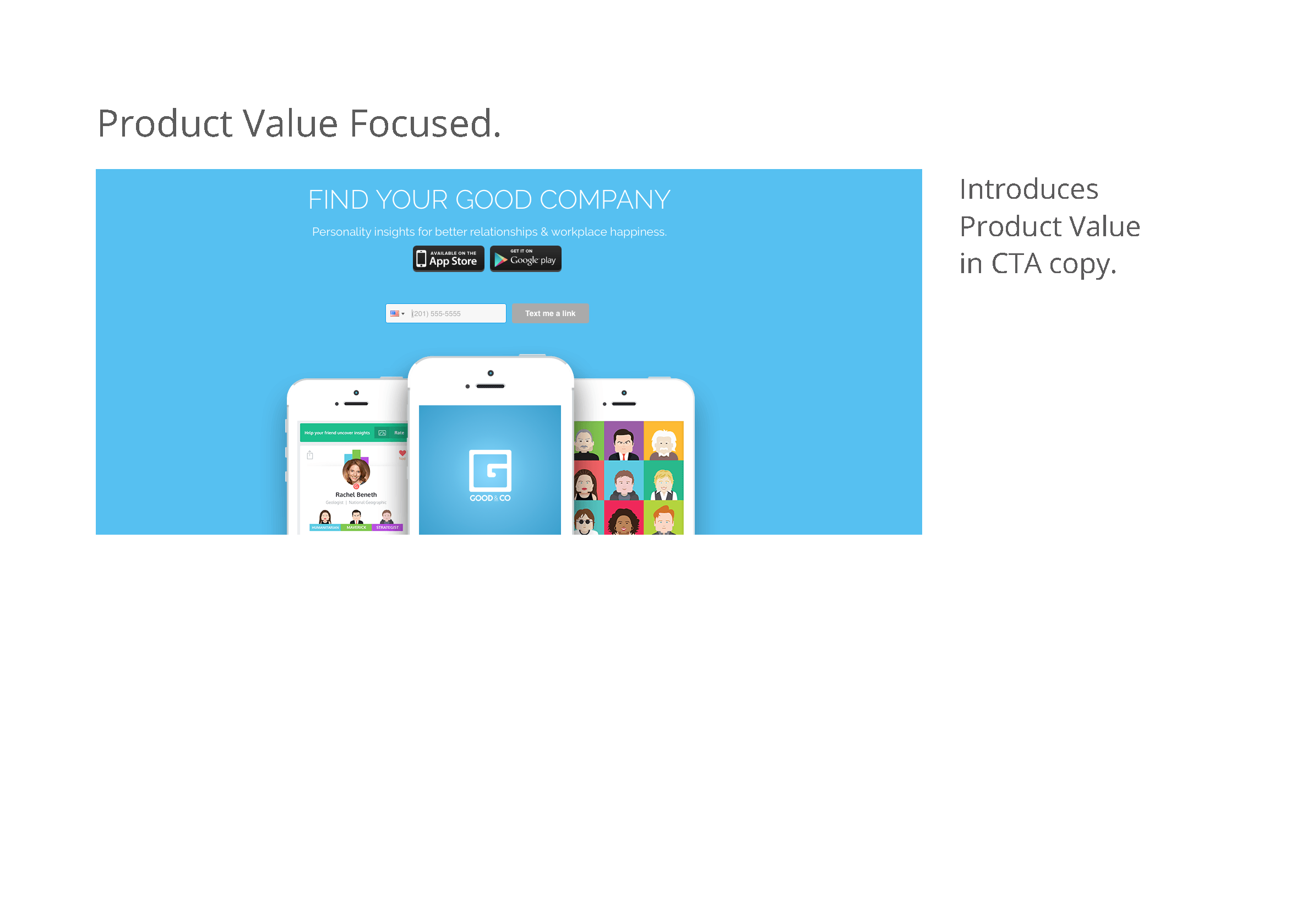
Elevated is about matching people to the right job for them. The previous home positioned it as a comprehensive job search, providing access to a large employment listing database supported by Simply Hired, which included a compatibility aspect. A "happy" work environment was the pitch. It was light and fun without much explanation.
The redesign shifted this to focus on being an employment matchmaker, more of an experienced headhunter than a job board. It surfaced screenshots of the compatibility surveys and explained how they lead to personalized results and the perfect work fit. It leveraged parent eHarmony and their experience bringing people together, to give legitimacy to this claim. We provided a clearer expectation of the product onboarding (an extensive questionnaire), as well as setting it apart from the competition (not a platform for blindly sifting through an abundance of jobs like other competitors, nor a newcomer to the compatibility game, like Sokanu).
Initial beta feedback showed users were confused about what Elevated is and why it's unique. After the revisions, comments showed a better understanding of the service and it's niche in the marketplace.
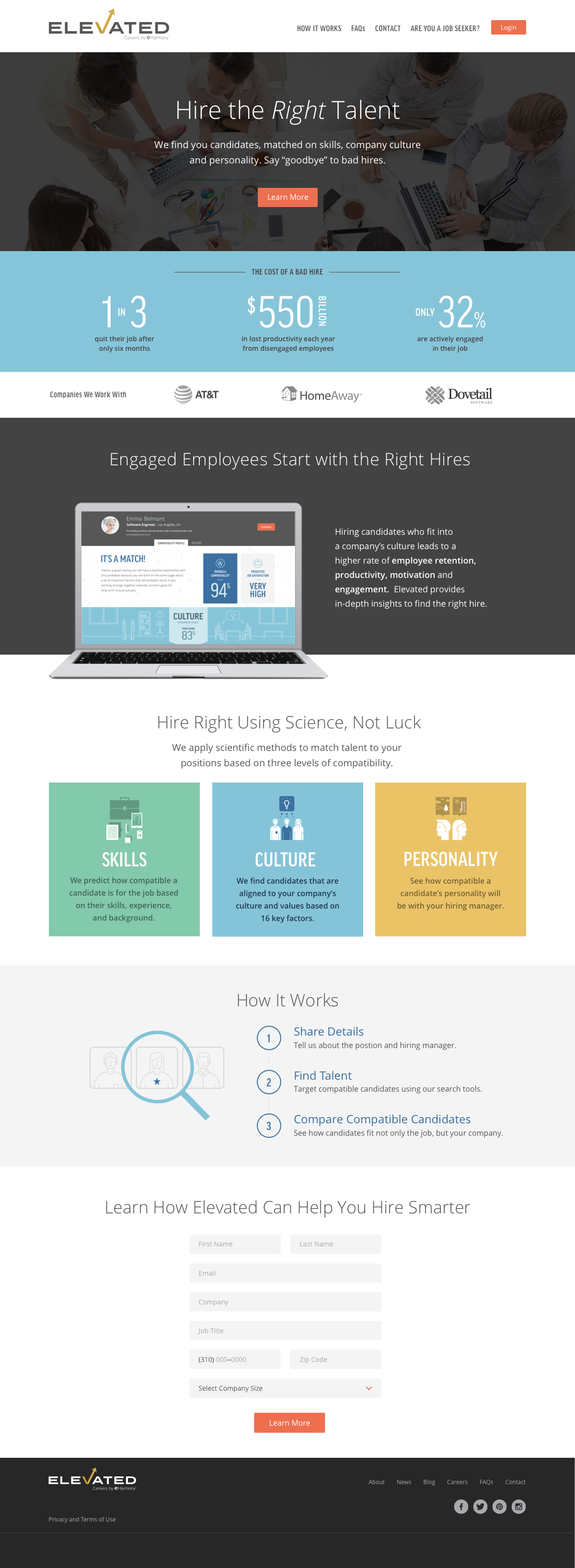
Hiring Company
Improvements
While I was there, Elevated pivoted from a focus on job seekers to hiring companies. This section was not part of the beta test. Hiring companies could post jobs, after filling out a survey similar to the questionnaire asked of potential employees. Elevated also offered an in-house analysis option that was receiving positive feedback and they hoped to expand on.
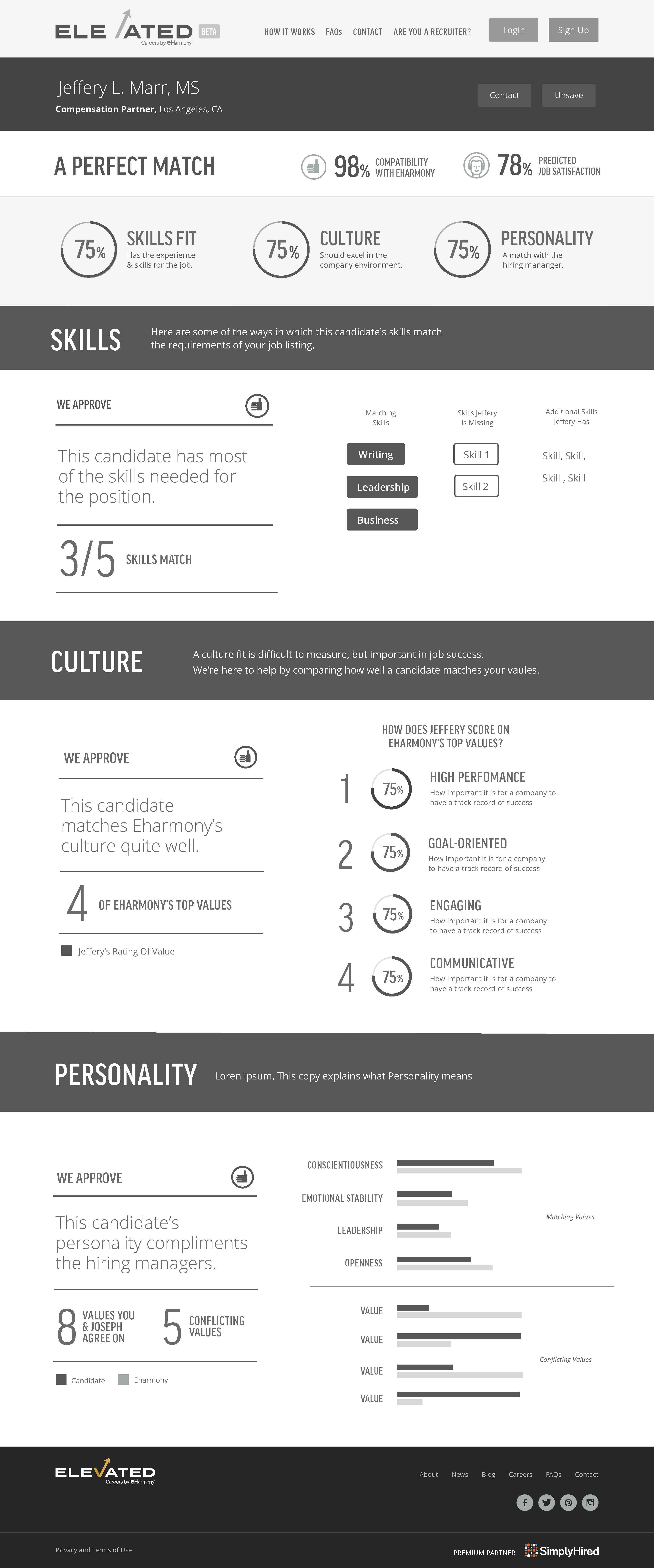
Match Results
To support the new focus on employers, I re-envisioned the compatibility results for hiring companies.
Some changes include:
Clear statement at the top as to candidate fit, depending on their score, one of four options would show. Example on right shows a successful candidate so "a perfect match". There's also a thumbs up or down that supports the messaging.
Overview of compatibility scores on top. Sections below expand on those skills. Each section has a clear statement and icon that summaries results on the left and supportive data points on the right.
Each section had a range of possible results, so a set of rules was set up dependent on variables. I designed modules to represent candidate aptitude to test this out. This required working with different departments to understand and review the data sets.
Home Redesign
I took the research from the job seeker home re-design and applied it to the hiring company home page. With the guidance of the e-Harmony team, we A/B tested variations of this design, with changes to the copy.
Some design changes were:
- Highlighted the cost of a bad hire and benefits of low retention with stats.
- Humanized copy, with less talk of productivity and engagement, more of the right fit.
- Moved the companies using Elevated to above the fold.
- Animated laptop screen moves through different product pages. Use Science, Not Luck section introduces each compatibility area.