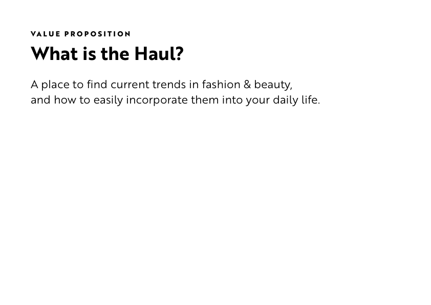
Stylehaul managed social media influencers. They had a library of video content created by talent and wanted to make it accessible in an editorial-style blog.
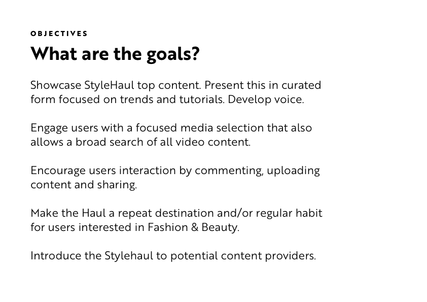
Aimed at teens and young women, the blog would focus on detailing beauty and fashion trends. Each trend story would showcase pre-existing media content from Stylehaul influencers. A new trend would be promoted monthly through their active social feeds.
My role was to help them clarify their ideas. They had a loose vision for what the product would be and I helped that vision take shape by offering different solutions, highlighting potential problem areas, and presenting ideas in a way they could be easily discussed. I worked on market research, conducting a focus group, and mobile wireframes. PM provided all the content and page concepts.
Given the target audience and content, I suggested a mobile-first approach. Before starting, we did a small user focus group on what media sites were being read and how, as well as thorough research on other similar sites.
The PM, who was leading this project, left so it went on hold. Later the client decided to move forward later with a simplified blog and created it in-house, so it never moved past the UX phase. However, I think this approach was helpful in making that decision.
Stylehaul
Research / Led Focus Group / Strategy / UX Concepts
Solo Design Project
2017
Discovery
Initial Meeting
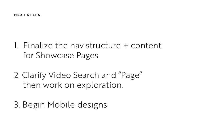
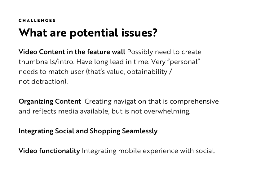
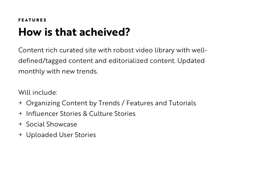
To kick-off the project, I outlined everything we had discussed prior to starting, what I expected to focus on, my research so far and ideas for next steps.
Focus Group
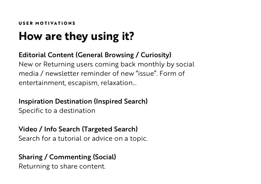
To see if our vision for the site was appropriate, I did a focus group with about twenty 16–21 year-olds. This included questions about their mobile habits, if and how they use beauty tutorials, their cultural consumption, and their favorite brands.
After talking with them, we all felt confident that a mobile-first approach was best. Focusing the video feed on seamlessly integrating into the device was a priority.
Looking back, I would have gathered a much younger group than we had, focusing more on the 11–16 year-olds. My initial research and vision should have skewed much younger.
Some Findings:
+ All participants have the smallest size i-phone and laptops, but none had home desktop computers.
+ Most common was splitting video watching equally between phone and laptop, though three of the participants primarily used their phone for video. All had used their phones when watching TV.
+ Moments is widely and actively used, used like a chatroom. This was most surprising to us olds in the room, bc we expected to see Instagram usage surpassing Twitter.
+ Instagram is used for beauty inspiration, but You-Tube is where tutorials are watched. While most considered screen views vital when considering watching a tutorial, they also appreciated finding new talent to follow. When deciding who to subscribe too, it was a universal feeling a less active feed was better. No one wanted to be overwhelmed with daily feed updates.
+ About 85% of the group were quite attached to their phones, bringing it into the shower/bathroom in the morning when getting ready. Many included it in daily tasks, like cooking or applying make-up, as guidance.
+ For most, their daily habits started young. For example, those who read teen vogue years earlier, kept up with it (almost more out of fondness, than an appreciation for it as their aesthetics have changed).
Site Overview
Overview of the site structure to confirm I was capturing their broader vision and discuss content strategy.
I came to this project at the initial stage of envisioning what it would be. The team had many ideas on content that were not fully thought through. I highlighted what could be curated from their video content library versus the copy and graphics that would have to be internally created monthly.
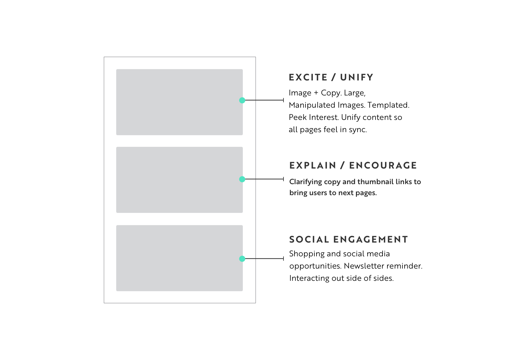
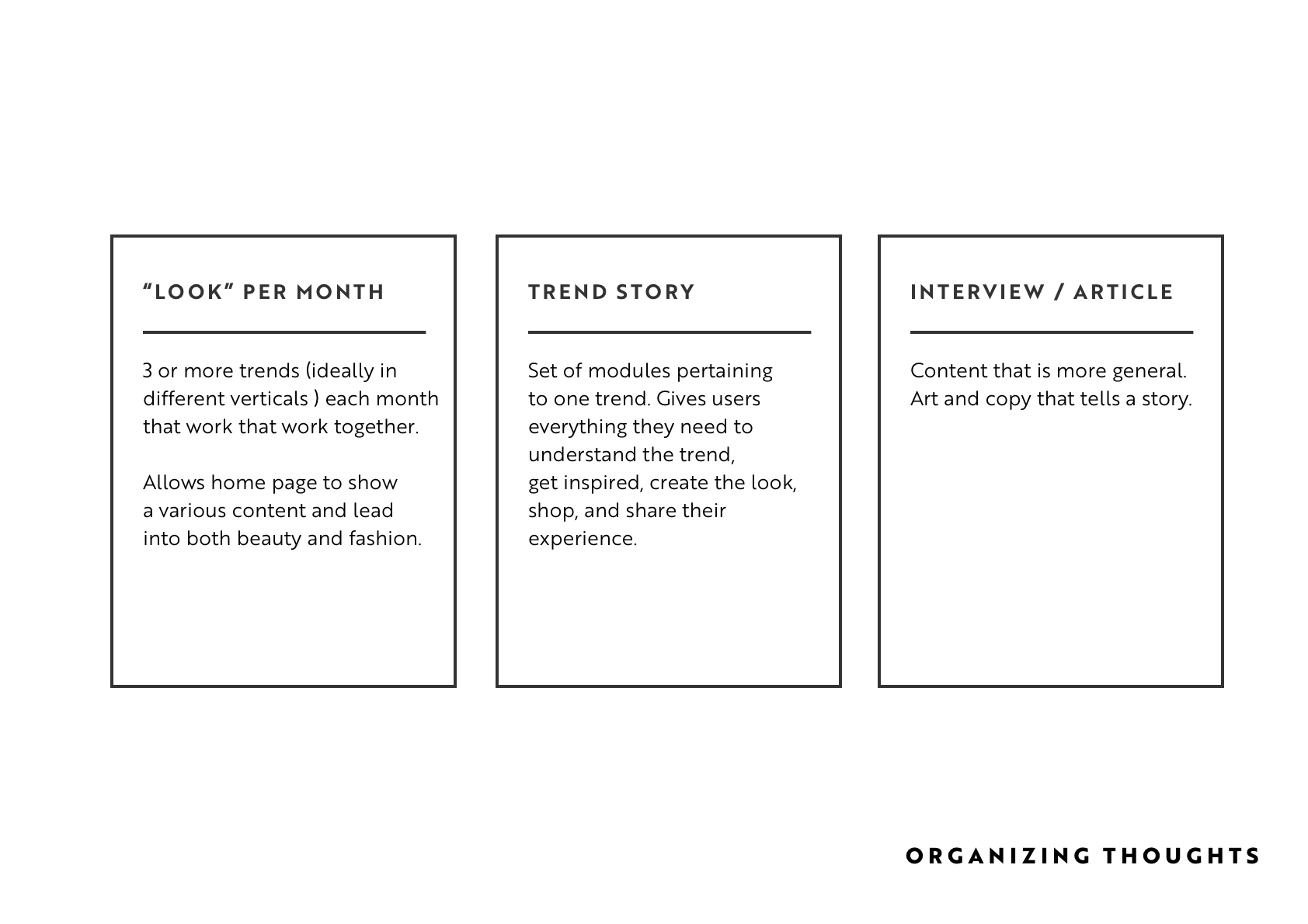
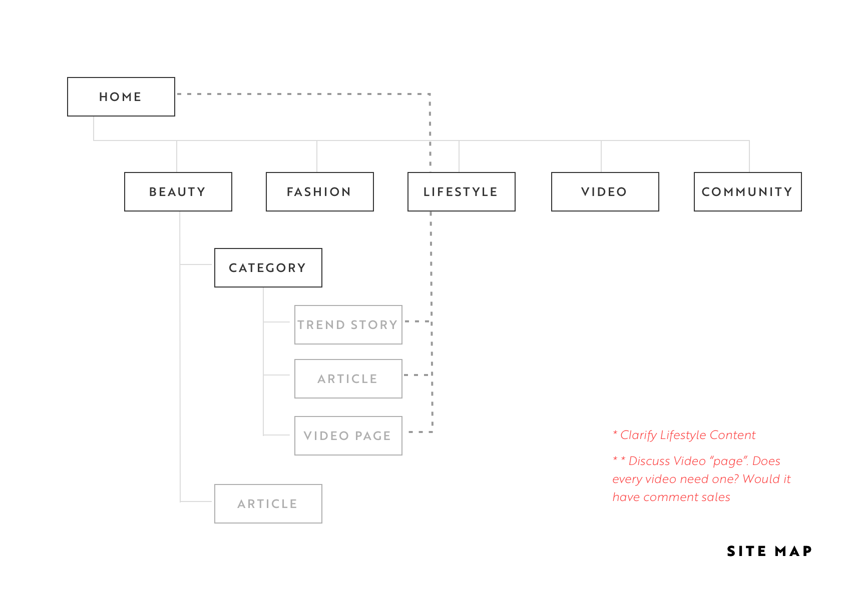
Sketches
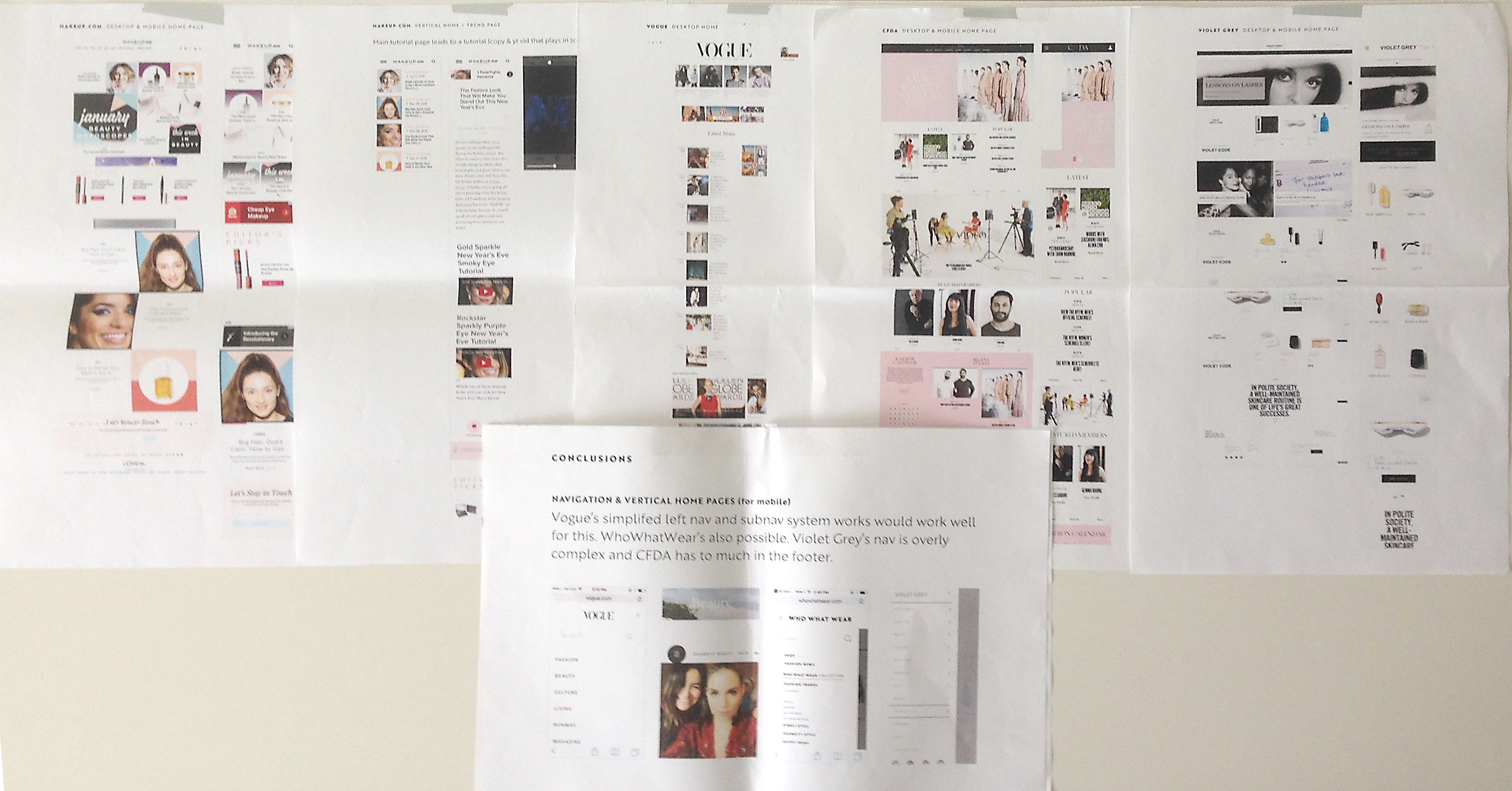
Initial sketches. Presentation materials I reviewed with the team for both content and UI patterns. I shared the full competitive analysis I had done.
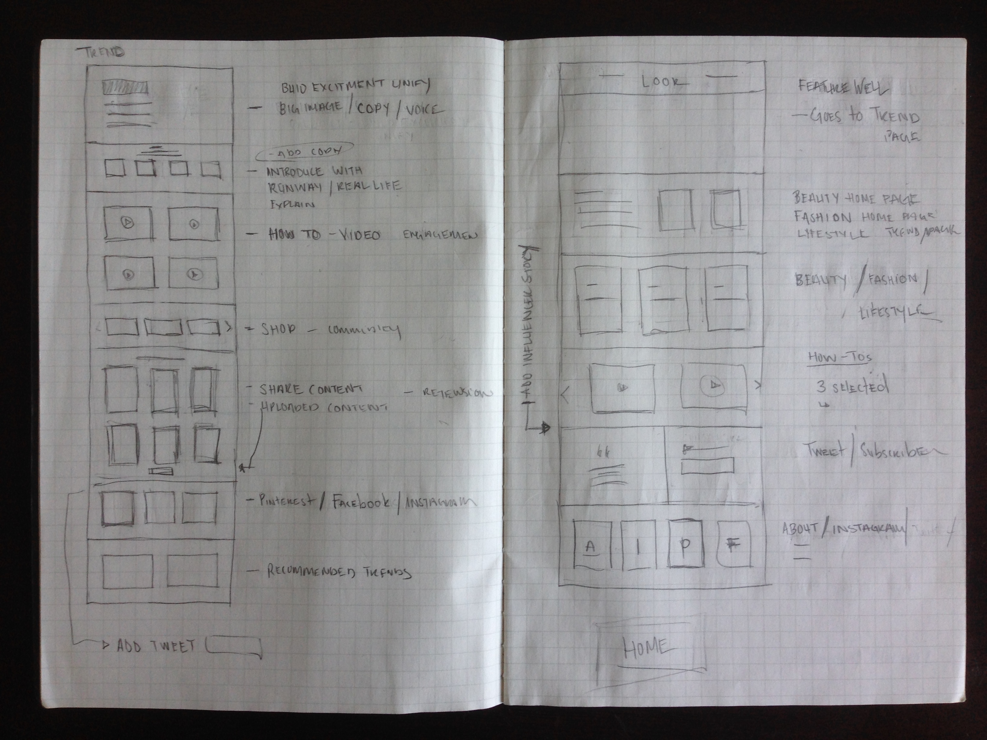
Mobile Wires
Flow
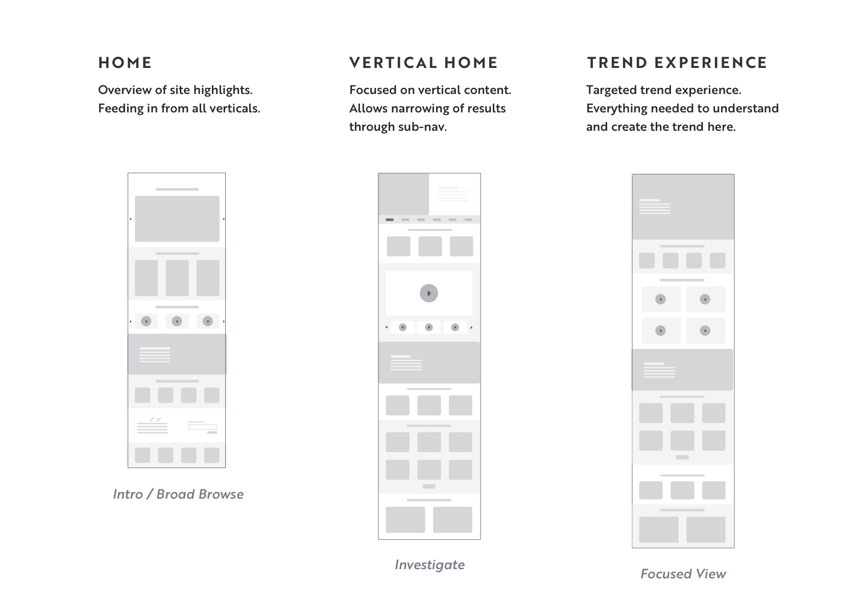
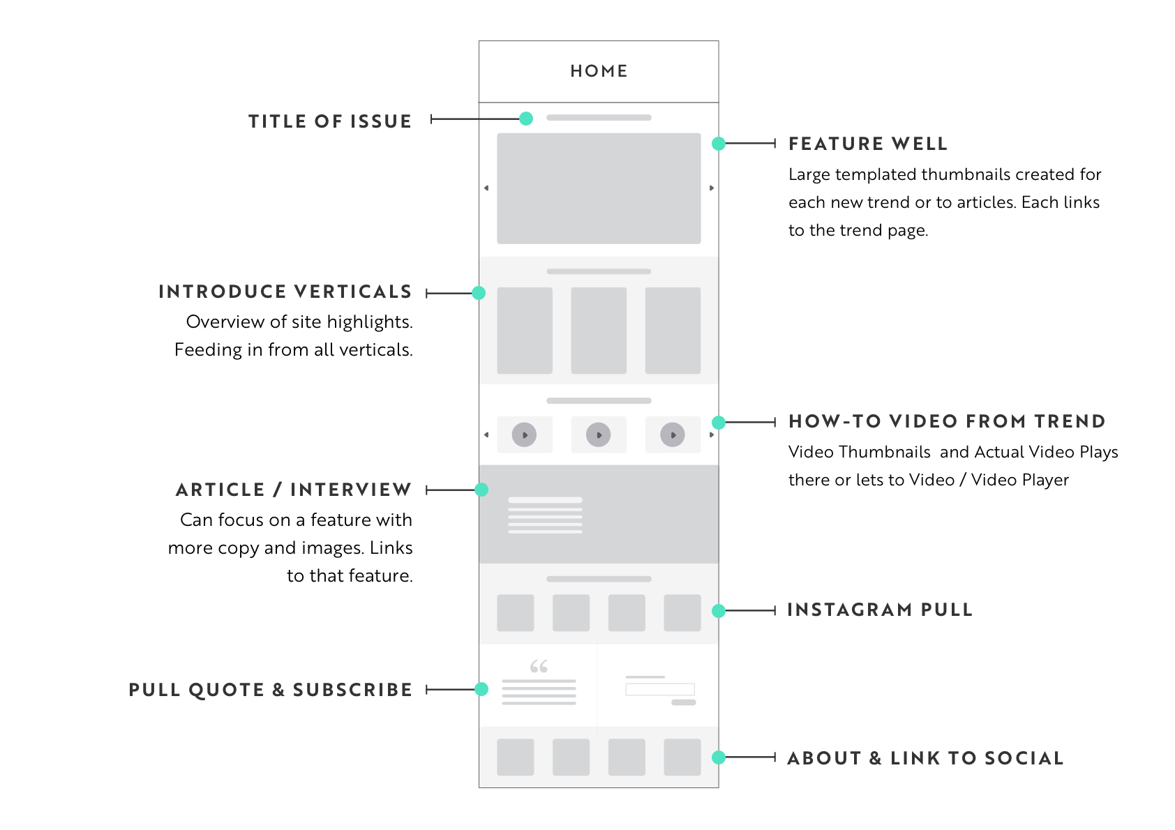
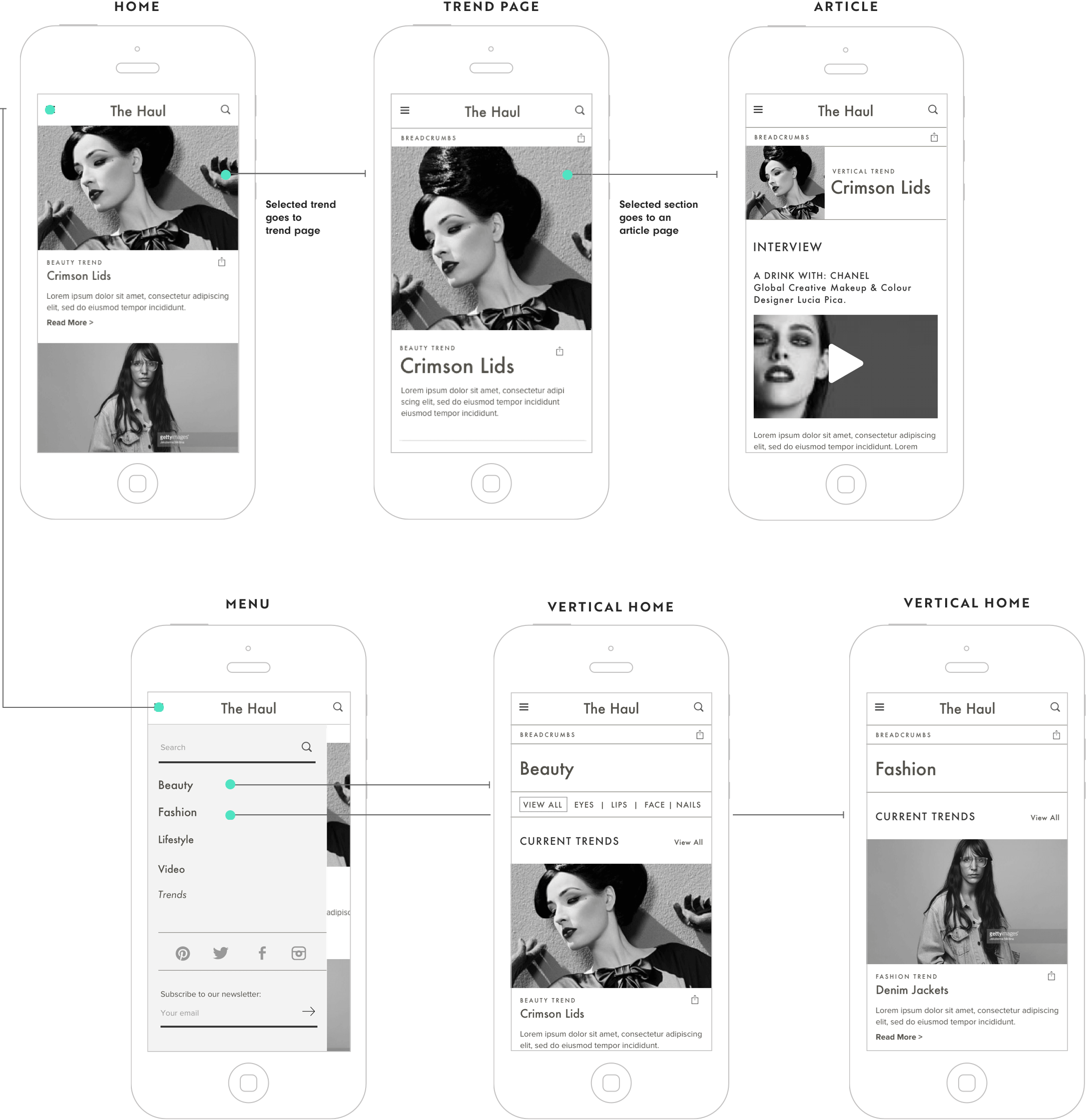
The site has a home page that features the current month's trends from different verticals. This leads to a trend page (most users would arrive here from social) where all the videos are gathered from different social influencers.
Wires
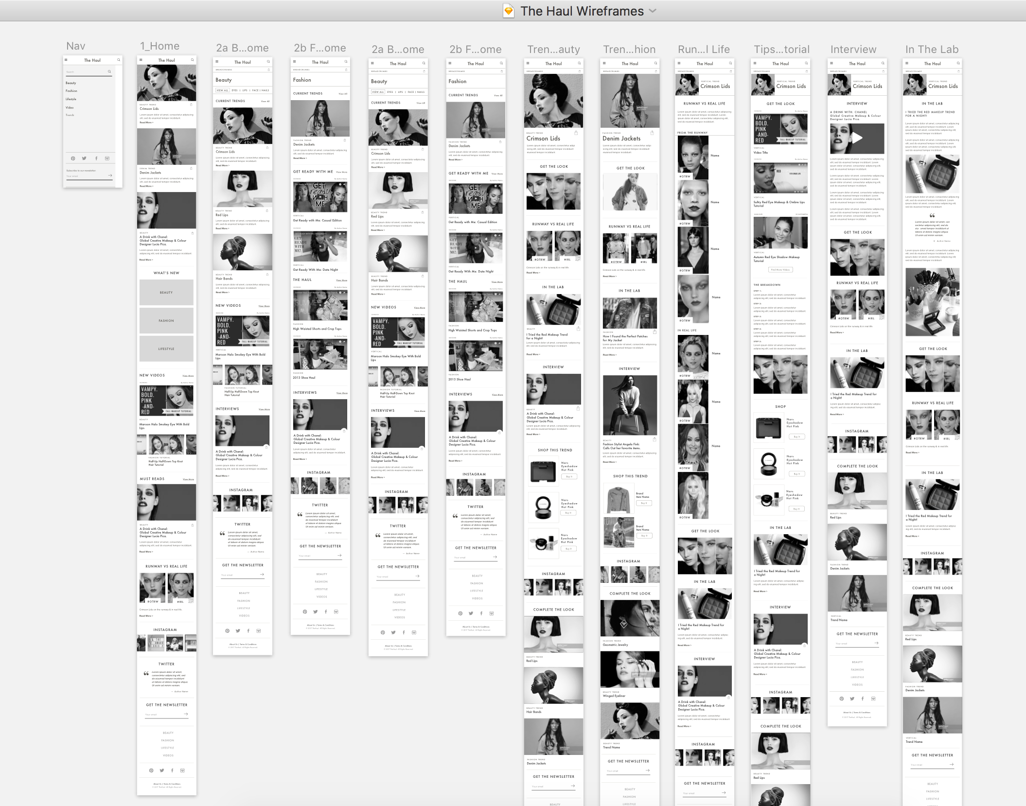
Wireframes were done in Sketch. There were also Invision prototypes I reviewed with the campaign managers.
The Homepage module included:
- Trends
- Graphic Link to each Vertical Home
- New Videos
- Features
- Social
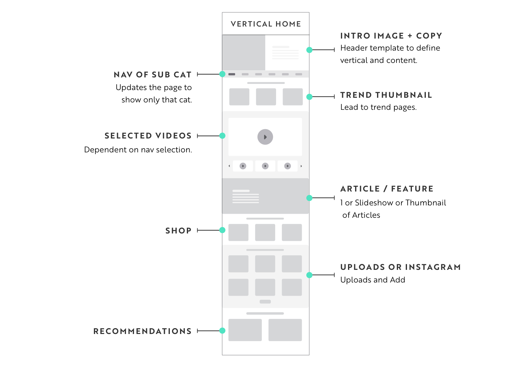
Beauty Home & Trend Page
Trends would be tagged into sucategories and as the content grew, this filtering would be visible on the beauty home page.
Both beauty and fashion home pages have a video module that allows users to randomly scroll through new content.
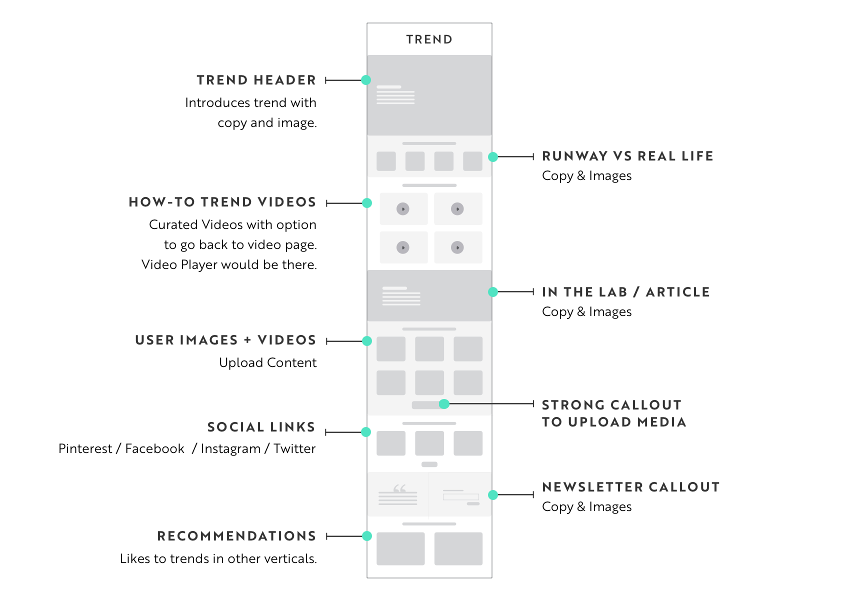
Trend pages included the main image and description of the trend, as well as features (such as Get the Look, Runway, In the Lab, and Interviews). We anticipated the "Get the Look" feature (make-up tutorials) to be a driver of traffic.


Trend Features

